Subversive Pinwheels
Inspiration:

Design process:

My first ideas for this project came from a trend forecast called Subversive 21st century avant-garde. Every word of the tiny paragraph from Textile View made me think of new possibilities. First I started to play around with the original colours of the forecast then I looked at photos of urban environment, colourful graffiti in particular. As I mixed up my colours I painted a sheet of paper with each. I ended up with a nice collection of shades to experiment with at the end.


I wanted to create something playful so when I found a photo in my archive of a hortesia with its beautiful colours and another photo of red fish swimming around in a lake my brain put them together and I set up my first composition. It also provided me new colour combinations.


I also found pictures of pinwheels in my archive. They made me think if I could put together a hortesia out of pinwheels. It would make my piece more 3D and they also refer to renewable energy. The exit table on the door in one of the photos gave me the idea to make the fish trying to escape from globalisation and found their way back to the nature where they belong to. The pinwheel photographs provided me a beautiful range of new colours so I was ready to set up my final colour chart.


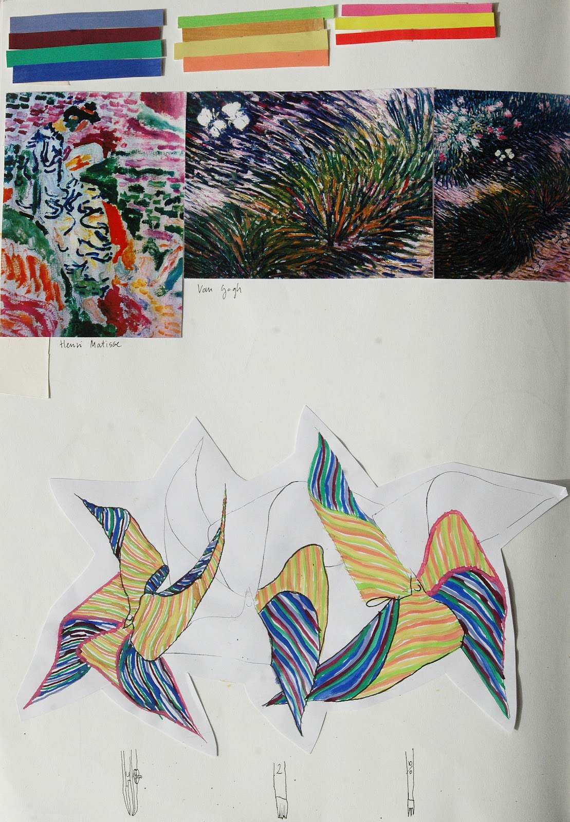
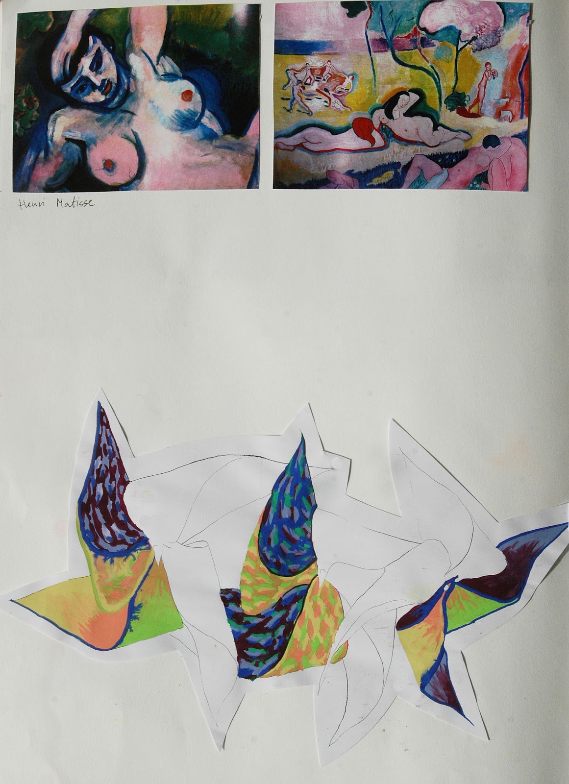
Following the directions of the original trend forecast I used pictures from different art movements as an inspiration. I made a couple of pinwheels then I started to draw them in different styles using the same range of colour but in different proportion.

At the end I combined all the different bits together and designed a flower built up of pinwheels with fish circulating between them. I scanned in the original image and started to play around with the background colour in Photoshop. It turned out that my final design goes with almost every single colour, which provides endless possibilities for final samples. I was happy to figure it out because it suits perfectly with my idea for the sustainable aspect.

In terms of context I’d like to see my design as a reversible skirt with a special wax like coating. Recently water consumption amongst many other factors turned out to be a very important aspect when it comes to make a decision about sustainable fabrics. Water consumed during laundry is significant so if we have to wash our clothes less we can save a lot of water. The Swiss Schoeller Company developed a high-tech finish called ecorepel that can be applied on many different types of fabric. It makes clothing water, dust, and dirt proof but keeps it soft and breathable at the same time. I would print my design on silk because I’d like to give it a bit shininess to make it even more fun.
My research on sustainability:

Sketchbook work:





Final designs:


Context:


